The Spring Palette by Clare Norrish Interior Design
This is a guest blog feature by Clare Norrish from Clare Norrish Interior Design.
Table of contents
The Spring Palette
At Clare Norrish Interior Design we don’t necessarily believe in following trends; we prefer to let ourselves be led by someone’s personal expression and taste. The design direction can also be dictated heavily by existing features and qualities of a space and its surroundings.
However, with the constant stream of images on social media and Pinterest these days and having the ability to track the interest in certain aesthetics, colours, materials, and effects, it’s hard to ignore what people are being drawn to at certain times of the year. We always like to keep abreast of what is trending so we can cherry-pick from those ideas and utilise the styles that we think will have longevity and disregard those that will more than likely be a passing fad.
After the dark, gloomy winter months the spring season seems to encourage people to make changes to brighten up their homes to match the sunnier warmer climate outside. With the new season upon us it’s time to show your home some love.
The phrase ‘bringing the outside in’ feels very cheesy to say out loud and has been overused for years but when the weather warms up enough for you to fling those doors wide open and utilise the garden as an extension to your home – why not. Embrace the colours provided by nature and let there be a flow of continuity and peace from your home to your garden.
Vibrant Colours Inspired by Nature
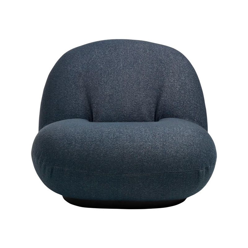
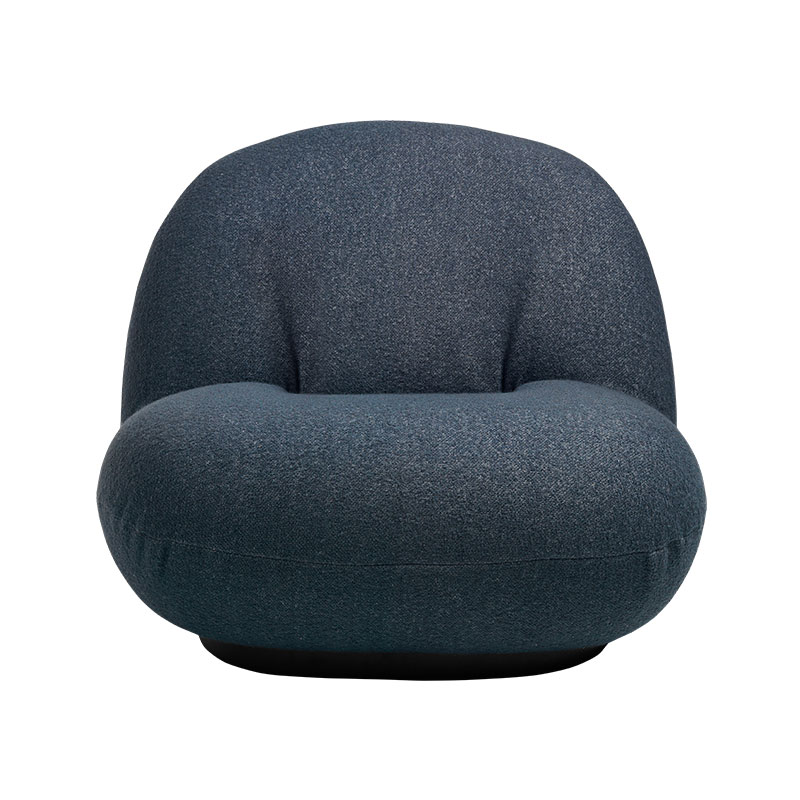
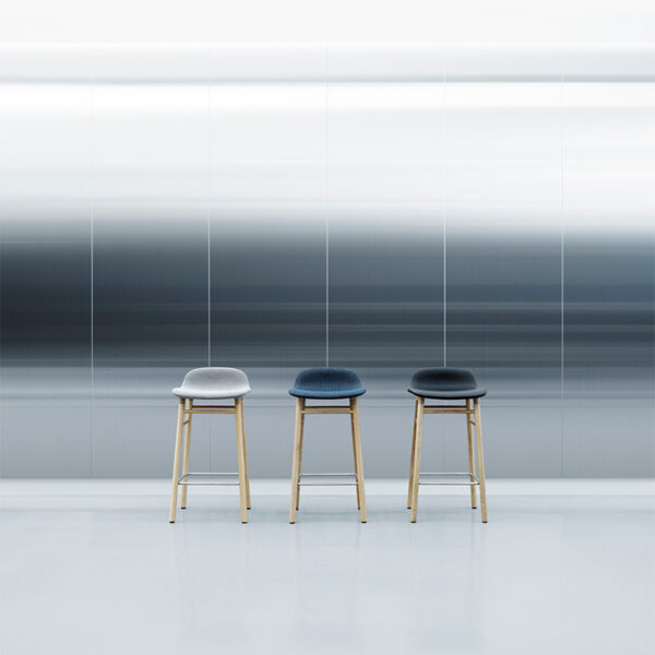
It is time now to banish those gloomy greys and refresh those colour schemes. Be brave and turn up the saturation. Take inspiration from those stunning new blooms and embrace the world outside your window. Vibrant orangey reds, pinks, greens, and blue hues seem to be dominating the interior colour palette this spring.
Pairing complimentary colours – (those that sit opposite each other on the colour wheel) is a timeless way to breathe life into a space. But for those of you less confident, consider adding a more muted, subtle colour pop for a slightly softer interior with pale blues and sage green.
(Farrow & Ball) have just launched their new dead flat paint for high traffic areas of your home to give an ultra-matt look. This paint is scrubbable and scuff resistant and can be used on multi-surfaces like walls and ceilings, woodwork, and metalwork. Sounds like a winner to me!
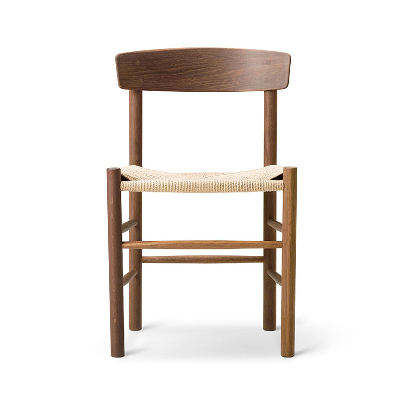
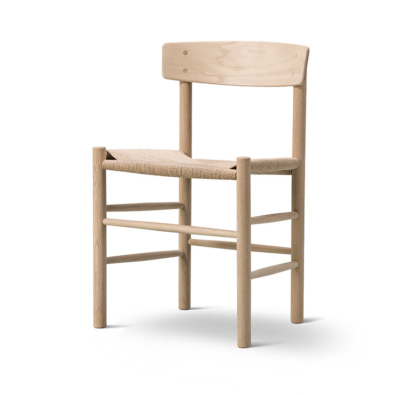
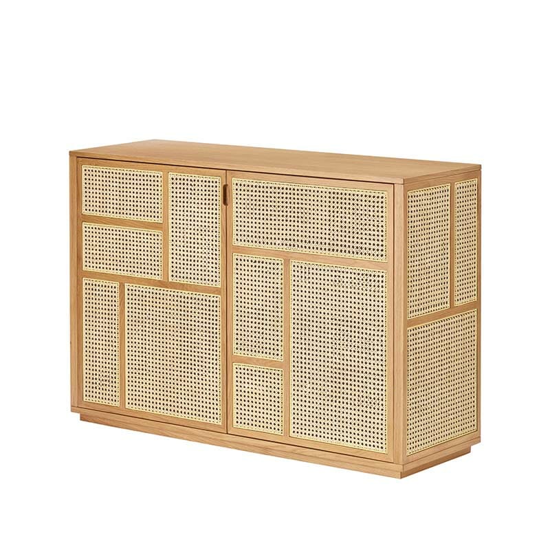
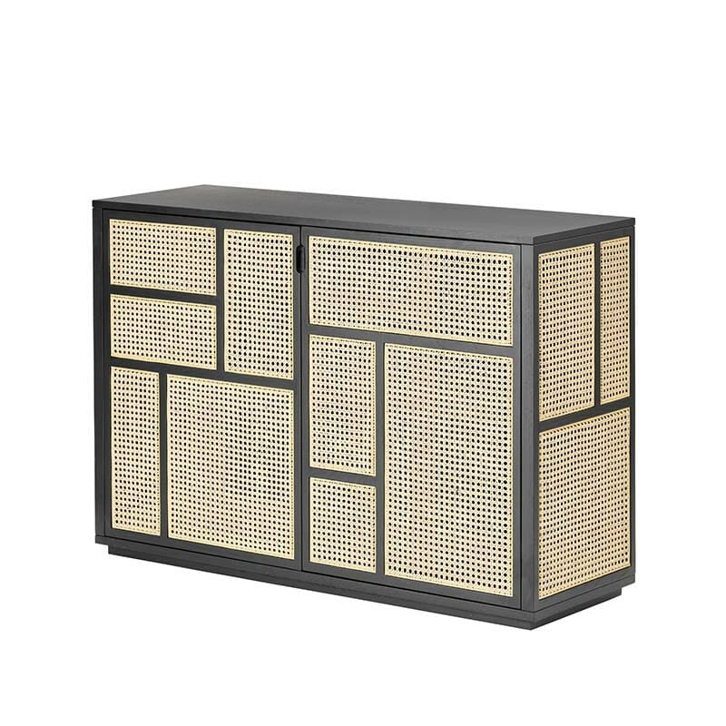
Earthy Tones
Raw organic materials and warm non-intrusive tones of brown ochre offer a cosy yet modern grounded base to your scheme. The use of earthy based hues offers a great connection with nature but often reflect a simpler lifestyle. Less is definitely more, and the use of contrasting materials is key to putting together a scheme with these muddier colours
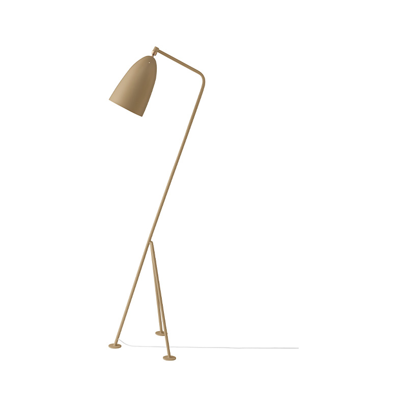
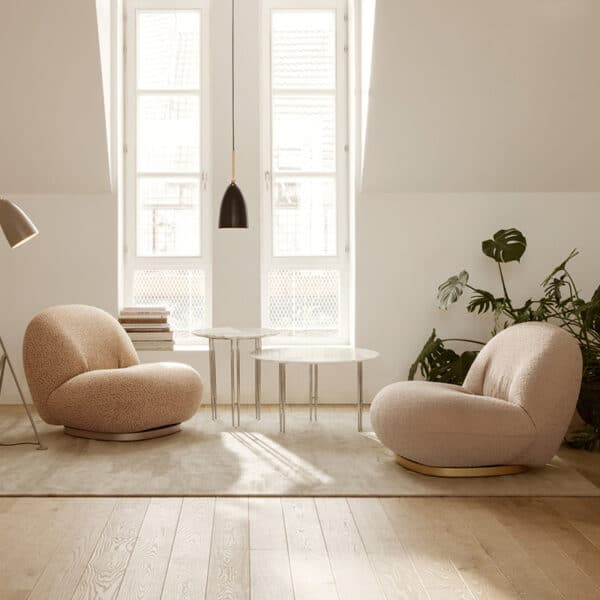
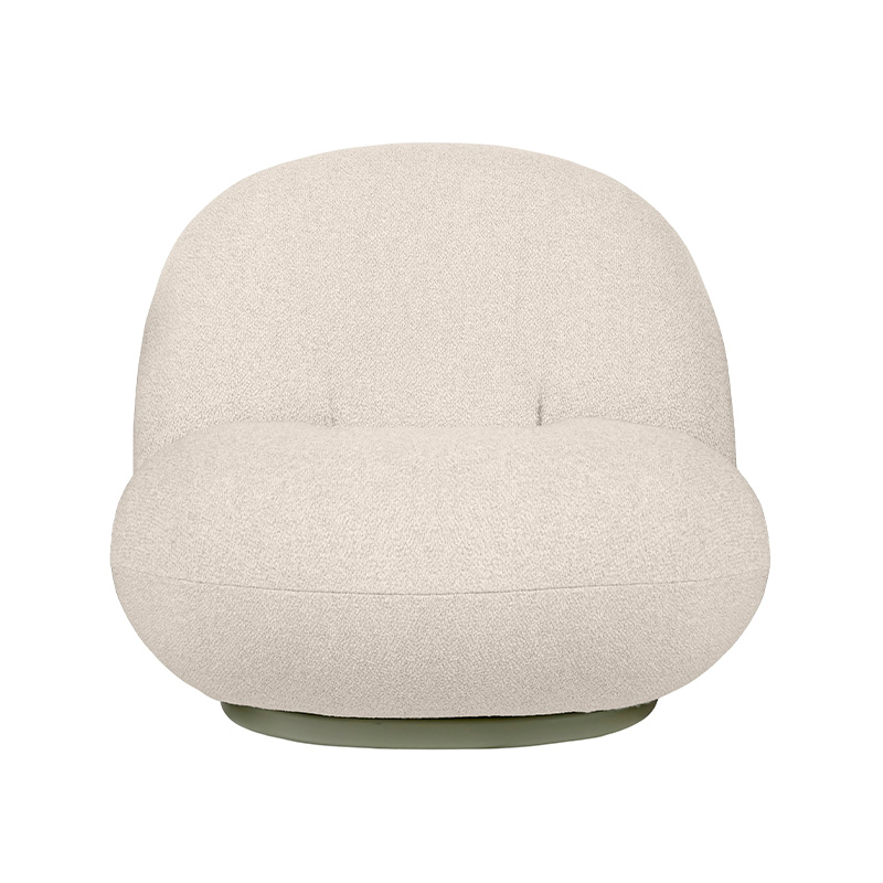
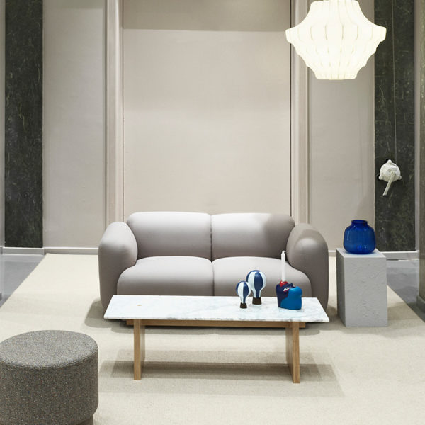
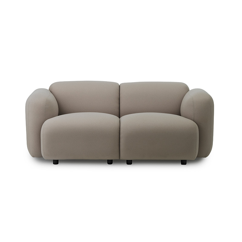
Warm Calming Neutrals
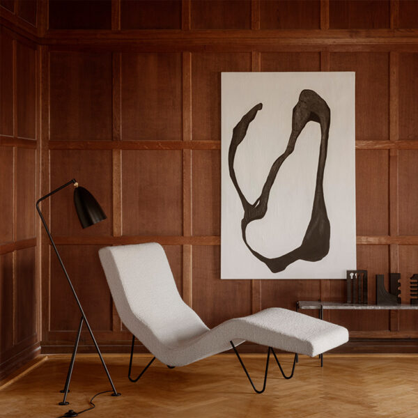
If colour is not your thing, warm neutrals embrace wellness and comfort and can create a very positive, relaxed environment giving a sense of calm & renewal. Be very careful to avoid a flat and clinical feeling to your space when using a totally neutral scheme. This can be avoided by injecting your palette with texture, whether that’s through wallpapers, rugs, or upholstery.
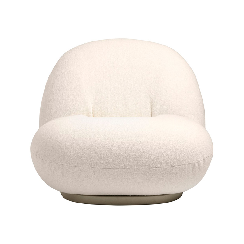
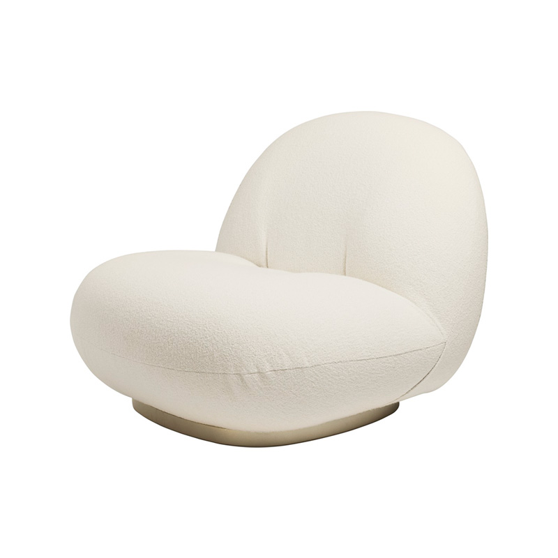
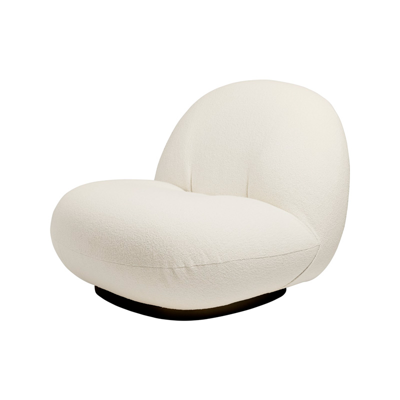
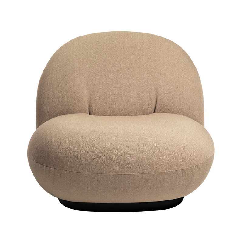
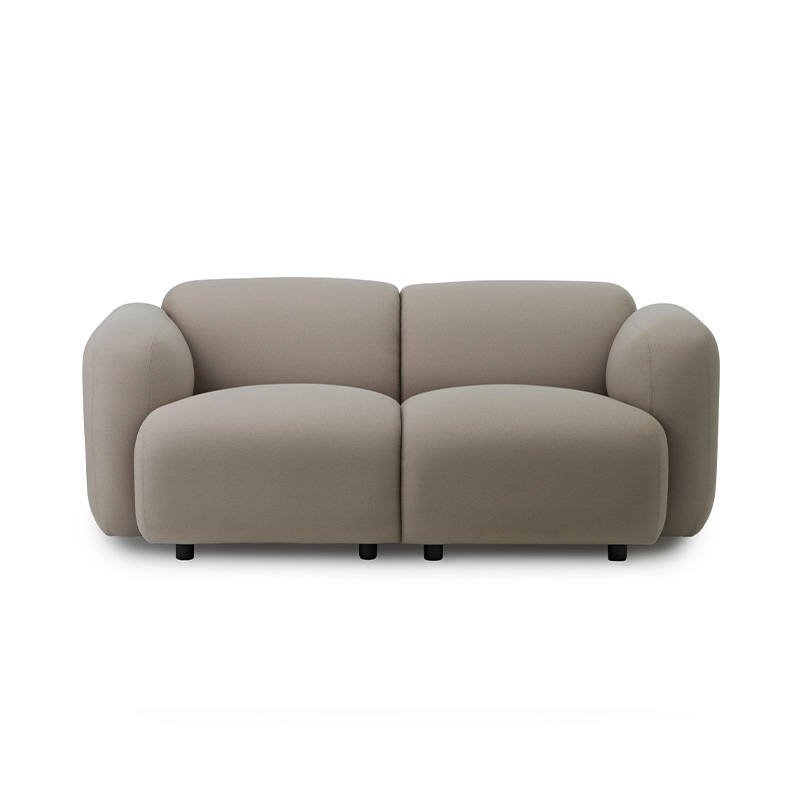
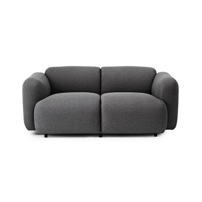
Soft tones of cream, ecru and white blank canvas for adding splashes of spring colours as well, bringing your scheme to life with coloured glassware, cushions, and artwork, and this can more often be a preference for our clients as the colours can easily be swapped out as the seasons change. Boucle is leading the way this year and can easily be paired with plush velvets, natural sisal, or heavy weight linens to create a sumptuous, cosy look.


